
Table of Contents
C# Button User Control
Just a quick post in how to create a Custom Button Control and then create a simple style.
Creating the User Control
Just like the last post well add a User Control called ButtonUC into our WPF application.
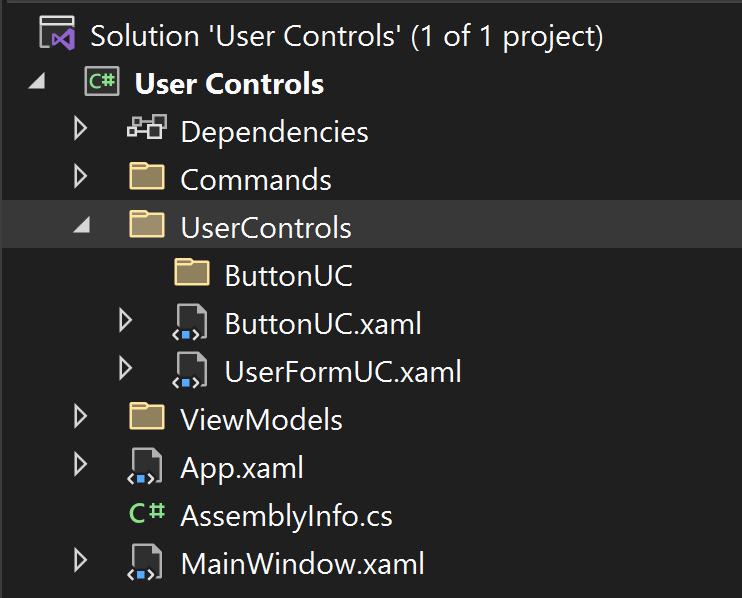
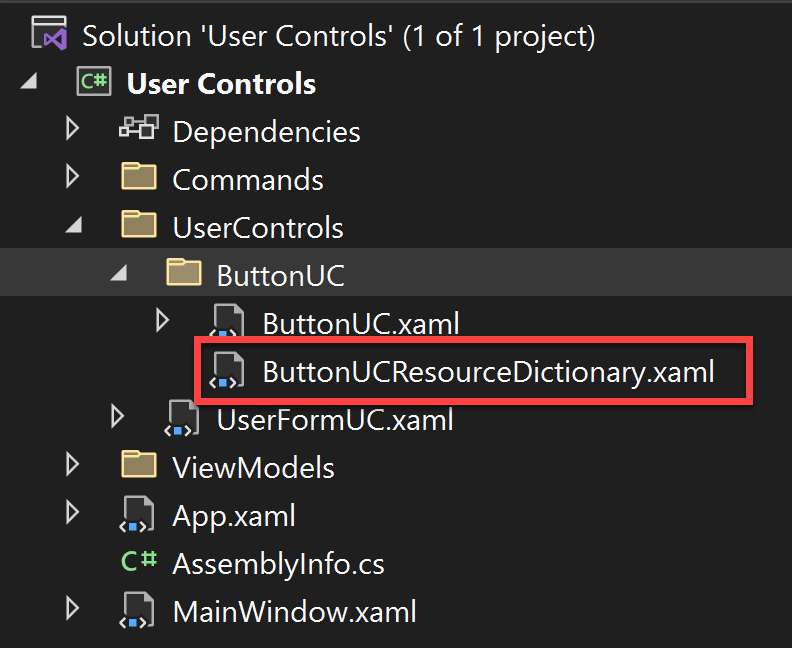
Note that I also added a ButtonUC folder for a quick side point. When creating multiple user controls you don’t want to have them in different folders on creation since this will set the namespace to include the name of the folder. This will result in multiple XML namespaces having to be declared in the WPF application your ultimately creating.
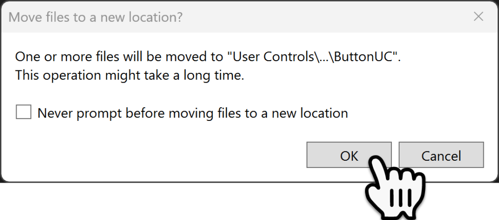
So I always create the user control below user controls and then drag and drop it into the folder for organization. When you do this your going to get two Questions, the first will ask if you really want to do this select Yes.
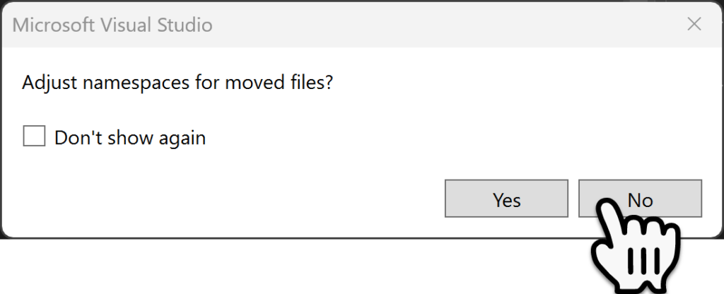
The second message will ask if you want to change the namespaces select No to this message.
NuGet Package
Within the NuGet Package manager search for and install the Maha Modern icon pack.

Creating the XAML
Now that’s done, we are going to make a couple of changes, first in the XAML well change the UserControl tag to a Button tag.
<Button x:Class="User_Controls.UserControls.ButtonUC"
        xmlns="http://schemas.microsoft.com/winfx/2006/xaml/presentation"
        xmlns:x="http://schemas.microsoft.com/winfx/2006/xaml"
        xmlns:mc="http://schemas.openxmlformats.org/markup-compatibility/2006"
        xmlns:d="http://schemas.microsoft.com/expression/blend/2008"
        mc:Ignorable="d"
        d:DesignHeight="50"
        d:DesignWidth="50">
    <Grid ClipToBounds="True" Background="Transparent">

    </Grid>
</Button>
The in the code behind we need to do a similar thing. Instead of Inheriting from the UserControl class well inherit from the Button class instead.
using System.Windows.Controls;

namespace User_Controls.UserControls
{
    public partial class ButtonUC : Button
    {
        public ButtonUC()
        {
            InitializeComponent();
        }
    }
}
We can now get back to the XAML.
<Button x:Class="User_Controls.UserControls.ButtonUC"
xmlns="http://schemas.microsoft.com/winfx/2006/xaml/presentation"
xmlns:x="http://schemas.microsoft.com/winfx/2006/xaml"
xmlns:mc="http://schemas.openxmlformats.org/markup-compatibility/2006"
xmlns:d="http://schemas.microsoft.com/expression/blend/2008"
xmlns:icons="http://metro.mahapps.com/winfx/xaml/iconpacks"
mc:Ignorable="d"
d:DesignHeight="50"
d:DesignWidth="50"
Background="Transparent"
x:Name="buttonUC">
<Grid
ClipToBounds="True"
Background="Transparent">
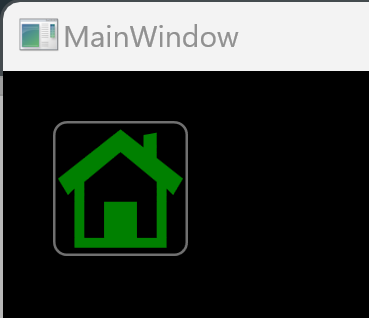
<icons:PackIconModern
Kind="Home"
Width="50"
Height="50"
Background="Transparent"
Foreground="Green"/>
</Grid>
</Button>This is a great start but a little styling goes along way.
Button User Control Styling
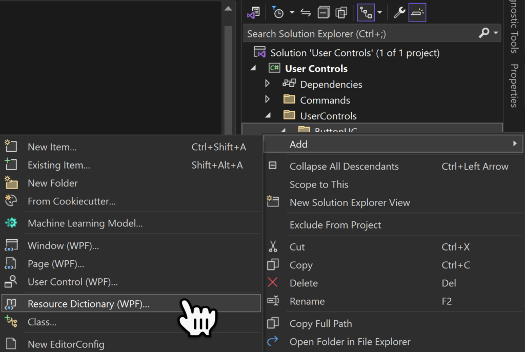
Lets start of by adding a new Resource Dictionary, right mouse click on the ButtonUC folder and select Add -> ResourceDictionary, this is fine since resource dictionary’s don’t have namespaces.
I use the Same Name as the User Control Name plus ResourceDictionary, you can use your own nomenclature. Once its added do a rebuild so that the solution knows about the new Resource Dictionary.
Before we can use this Resource Dictionary we have to tell the User Control it Exists. This is done by adding the Button Resources tag structure shown below. The Source path looks really scary but its not to bad.
- pack://application:,,,/ is a standard part of the path.
- in the build directory we need the name of the exe or dll being built in this case its “User Controls“.
- ;Component/ is a standard part of the path.
- /ButtonUC is the folder within the project.
- /ButtonUCResourceDictionary.xaml is the name of the file.
<Button x:Class="User_Controls.UserControls.ButtonUC"
xmlns="http://schemas.microsoft.com/winfx/2006/xaml/presentation"
xmlns:x="http://schemas.microsoft.com/winfx/2006/xaml"
xmlns:mc="http://schemas.openxmlformats.org/markup-compatibility/2006"
xmlns:d="http://schemas.microsoft.com/expression/blend/2008"
xmlns:icons="http://metro.mahapps.com/winfx/xaml/iconpacks"
mc:Ignorable="d"
d:DesignHeight="50"
d:DesignWidth="50"
Background="Transparent"
x:Name="buttonUC">
<Button.Resources>
<ResourceDictionary>
<ResourceDictionary.MergedDictionaries>
<ResourceDictionary Source="pack://application:,,,/User Controls;Component/UserControls/ButtonUC/ButtonUCResourceDictionary.xaml"/>
</ResourceDictionary.MergedDictionaries>
<!-- Local styles here -->
</ResourceDictionary>
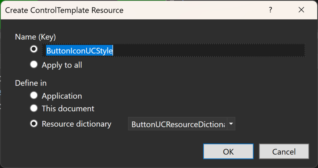
</Button.Resources>Now we can Right Mouse Clicked on the Button border and not the Icon, and selected Edit Template -> Edit a Copy…
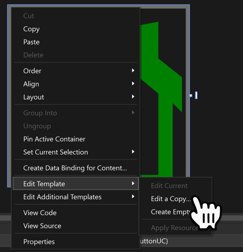
Within the Name (key) field key in a name for the style, then select Resource dictionary in the bottom part of the form and select the Resources Dictionary just created, then select Ok.
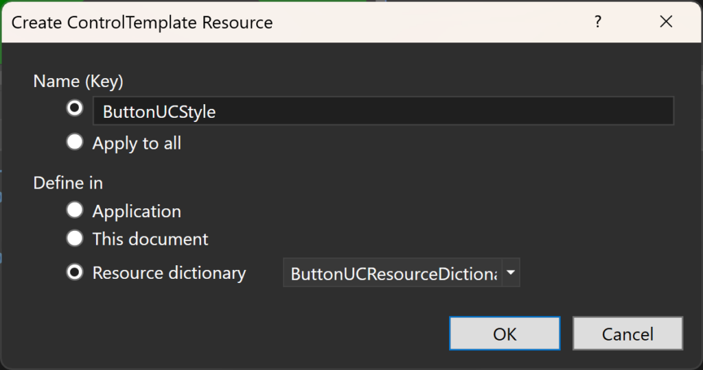
Two things will happen a copy of the current template will be extracted out to the Resource Dictionary and secondly the XAML will be edited to point towards this file.
<ResourceDictionary xmlns="http://schemas.microsoft.com/winfx/2006/xaml/presentation"
                    xmlns:x="http://schemas.microsoft.com/winfx/2006/xaml">

    <Style x:Key="FocusVisual">
        <Setter Property="Control.Template">
            <Setter.Value>
                <ControlTemplate>
                    <Rectangle Margin="2" StrokeDashArray="1 2" Stroke="{DynamicResource {x:Static SystemColors.ControlTextBrushKey}}" SnapsToDevicePixels="true" StrokeThickness="1"/>
                </ControlTemplate>
            </Setter.Value>
        </Setter>
    </Style>
    <SolidColorBrush x:Key="Button.Static.Background" Color="#FFDDDDDD"/>
    <SolidColorBrush x:Key="Button.Static.Border" Color="#FF707070"/>
    <SolidColorBrush x:Key="Button.MouseOver.Background" Color="#FFBEE6FD"/>
    <SolidColorBrush x:Key="Button.MouseOver.Border" Color="#FF3C7FB1"/>
    <SolidColorBrush x:Key="Button.Pressed.Background" Color="#FFC4E5F6"/>
    <SolidColorBrush x:Key="Button.Pressed.Border" Color="#FF2C628B"/>
    <SolidColorBrush x:Key="Button.Disabled.Background" Color="#FFF4F4F4"/>
    <SolidColorBrush x:Key="Button.Disabled.Border" Color="#FFADB2B5"/>
    <SolidColorBrush x:Key="Button.Disabled.Foreground" Color="#FF838383"/>
    <Style x:Key="ButtonUCStyle" TargetType="{x:Type Button}">
        <Setter Property="FocusVisualStyle" Value="{StaticResource FocusVisual}"/>
        <Setter Property="Background" Value="{StaticResource Button.Static.Background}"/>
        <Setter Property="BorderBrush" Value="{StaticResource Button.Static.Border}"/>
        <Setter Property="Foreground" Value="{DynamicResource {x:Static SystemColors.ControlTextBrushKey}}"/>
        <Setter Property="BorderThickness" Value="1"/>
        <Setter Property="HorizontalContentAlignment" Value="Center"/>
        <Setter Property="VerticalContentAlignment" Value="Center"/>
        <Setter Property="Padding" Value="1"/>
        <Setter Property="Template">
            <Setter.Value>
                <ControlTemplate TargetType="{x:Type Button}">
                    <Border x:Name="border" Background="{TemplateBinding Background}" BorderBrush="{TemplateBinding BorderBrush}" BorderThickness="{TemplateBinding BorderThickness}" SnapsToDevicePixels="true">
                        <ContentPresenter x:Name="contentPresenter" Focusable="False" HorizontalAlignment="{TemplateBinding HorizontalContentAlignment}" Margin="{TemplateBinding Padding}" RecognizesAccessKey="True" SnapsToDevicePixels="{TemplateBinding SnapsToDevicePixels}" VerticalAlignment="{TemplateBinding VerticalContentAlignment}"/>
                    </Border>
                    <ControlTemplate.Triggers>
                        <Trigger Property="IsDefaulted" Value="true">
                            <Setter Property="BorderBrush" TargetName="border" Value="{DynamicResource {x:Static SystemColors.HighlightBrushKey}}"/>
                        </Trigger>
                        <Trigger Property="IsMouseOver" Value="true">
                            <Setter Property="Background" TargetName="border" Value="{StaticResource Button.MouseOver.Background}"/>
                            <Setter Property="BorderBrush" TargetName="border" Value="{StaticResource Button.MouseOver.Border}"/>
                        </Trigger>
                        <Trigger Property="IsPressed" Value="true">
                            <Setter Property="Background" TargetName="border" Value="{StaticResource Button.Pressed.Background}"/>
                            <Setter Property="BorderBrush" TargetName="border" Value="{StaticResource Button.Pressed.Border}"/>
                        </Trigger>
                        <Trigger Property="IsEnabled" Value="false">
                            <Setter Property="Background" TargetName="border" Value="{StaticResource Button.Disabled.Background}"/>
                            <Setter Property="BorderBrush" TargetName="border" Value="{StaticResource Button.Disabled.Border}"/>
                            <Setter Property="TextElement.Foreground" TargetName="contentPresenter" Value="{StaticResource Button.Disabled.Foreground}"/>
                        </Trigger>
                    </ControlTemplate.Triggers>
                </ControlTemplate>
            </Setter.Value>
        </Setter>
    </Style>
</ResourceDictionary>
Now we can edit this file to style the button.
Adding a Corner Radius
Within the Border tag add an additional property called CornerRadius with a Value of 5.
<ControlTemplate TargetType="{x:Type Button}">
<Border
x:Name="border"
Background="{TemplateBinding Background}"
BorderBrush="{TemplateBinding BorderBrush}"
BorderThickness="{TemplateBinding BorderThickness}"
SnapsToDevicePixels="true"
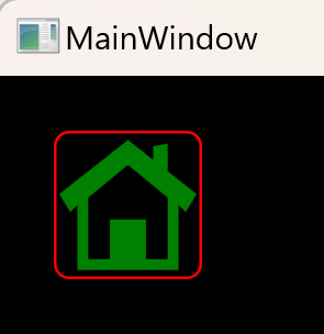
CornerRadius="5">Now we can see the corner radius on the button.
Button Border
We can now play around with the colors in the Solid Color Brush section to style the colors of the button border.
<SolidColorBrush x:Key="Button.Static.Background" Color="#FFDDDDDD"/>
<SolidColorBrush x:Key="Button.Static.Border" Color="#FF707070"/>
<SolidColorBrush x:Key="Button.MouseOver.Background" Color="Transparent"/>
<SolidColorBrush x:Key="Button.MouseOver.Border" Color="Red"/>
<SolidColorBrush x:Key="Button.Pressed.Background" Color="#FFC4E5F6"/>
<SolidColorBrush x:Key="Button.Pressed.Border" Color="#FF2C628B"/>
<SolidColorBrush x:Key="Button.Disabled.Background" Color="#FFF4F4F4"/>
<SolidColorBrush x:Key="Button.Disabled.Border" Color="Black"/>
<SolidColorBrush x:Key="Button.Disabled.Foreground" Color="#FF838383"/>
Now when the Mouse is Over the button the Border changes color to Red.
Icon Style
We can also Edit a Copy of the Icon Template and Select the same resource Dictionary.
TBC