Table of Contents
C# WPF Treeview
Quick post showing how to create a nice little Treeview for a folder structure.
Folder Model
Lets start off with the Folder Model
public class FolderModel : INotifyPropertyChanged
{
    private string _name;
    public string Name
    {
        get => _name;
        set
        {
            _name = value;
            OnPropertyChanged(nameof(Name));
        }
    }

    private ObservableCollection<FolderModel> _subFolders;
    public ObservableCollection<FolderModel> SubFolders
    {
        get => _subFolders ?? (_subFolders = new ObservableCollection<FolderModel>());
        set
        {
            _subFolders = value;
            OnPropertyChanged(nameof(SubFolders));
        }
    }

    public FolderModel()
    {
        SubFolders = new ObservableCollection<FolderModel>();
    }

    public event PropertyChangedEventHandler PropertyChanged;

    protected virtual void OnPropertyChanged(string propertyName)
    {
        PropertyChanged?.Invoke(this, new PropertyChangedEventArgs(propertyName));
    }
}
Folder View Model
Since we like MVVM lets create a simple view model.
public class FolderViewModel : INotifyPropertyChanged
{
    private FolderModel _rootFolder;
    public FolderModel RootFolder
    {
        get => _rootFolder;
        set
        {
            _rootFolder = value;
            OnPropertyChanged(nameof(RootFolder));
        }
    }

    public FolderViewModel(string rootPath)
    {
        LoadFolderStructure(rootPath);
    }

    private void LoadFolderStructure(string path)
    {
        RootFolder = new FolderModel { Name = System.IO.Path.GetFileName(path) };
        LoadSubFolders(RootFolder, path);
    }

    private void LoadSubFolders(FolderModel parentFolder, string path)
    {
        try
        {
            foreach (var directory in System.IO.Directory.GetDirectories(path))
            {
                try
                {
                    var folderModel = new FolderModel { Name = System.IO.Path.GetFileName(directory) };
                    parentFolder.SubFolders.Add(folderModel);
                    LoadSubFolders(folderModel, directory);
                }
                catch (UnauthorizedAccessException)
                {
                    // Handle inaccessible folder
                    var inaccessibleFolder = new FolderModel { Name = System.IO.Path.GetFileName(directory) + " (Access Denied)" };
                    parentFolder.SubFolders.Add(inaccessibleFolder);
                }
            }
        }
        catch (UnauthorizedAccessException)
        {
            // Handle the case where we can't even list the contents of the parent folder
            parentFolder.Name += " (Access Denied)";
        }
        catch (Exception ex)
        {
            // Handle other potential exceptions
            System.Diagnostics.Debug.WriteLine($"Error accessing folder {path}: {ex.Message}");
        }
    }

    public event PropertyChangedEventHandler PropertyChanged;

    protected virtual void OnPropertyChanged(string propertyName)
    {
        PropertyChanged?.Invoke(this, new PropertyChangedEventArgs(propertyName));
    }
}
WPF XAML
Now we can put it together.
<Window x:Class="WpfApp11.MainWindow"
        xmlns="http://schemas.microsoft.com/winfx/2006/xaml/presentation"
        xmlns:x="http://schemas.microsoft.com/winfx/2006/xaml"
        xmlns:d="http://schemas.microsoft.com/expression/blend/2008"
        xmlns:mc="http://schemas.openxmlformats.org/markup-compatibility/2006"
        xmlns:local="clr-namespace:WpfApp11"
        mc:Ignorable="d"
        Title="MainWindow" Height="450" Width="800">

    <Window.Resources>

        <Style x:Key="ExpandCollapseToggleStyle" TargetType="ToggleButton">
            <Setter Property="Focusable" Value="False"/>
            <Setter Property="Template">
                <Setter.Value>
                    <ControlTemplate TargetType="ToggleButton">
                        <Border Width="16" Height="16" Background="Transparent">
                            <Path x:Name="ExpandPath" Stroke="#FF989898" Fill="Transparent"
                                  Data="M0,0 L0,6 L6,0 z"
                                  Width="8" Height="8" Stretch="Uniform"
                                  HorizontalAlignment="Center" VerticalAlignment="Center"/>
                        </Border>
                        <ControlTemplate.Triggers>
                            <Trigger Property="IsChecked" Value="True">
                                <Setter Property="Data" TargetName="ExpandPath" Value="M0,0 L8,0 L4,4 z"/>
                            </Trigger>
                        </ControlTemplate.Triggers>
                    </ControlTemplate>
                </Setter.Value>
            </Setter>
        </Style>

        <Style x:Key="CustomContextMenuStyle" TargetType="{x:Type ContextMenu}">
            <Setter Property="SnapsToDevicePixels" Value="True" />
            <Setter Property="OverridesDefaultStyle" Value="True" />
            <Setter Property="Grid.IsSharedSizeScope" Value="true" />
            <Setter Property="HasDropShadow" Value="True" />
            <Setter Property="Template">
                <Setter.Value>
                    <ControlTemplate TargetType="{x:Type ContextMenu}">
                        <Border
                        x:Name="Border"
                        Background="#F5F5F5"
                        BorderBrush="#ACACAC"
                        BorderThickness="1"
                        CornerRadius="4">
                            <StackPanel IsItemsHost="True" KeyboardNavigation.DirectionalNavigation="Cycle" />
                        </Border>
                        <ControlTemplate.Triggers>
                            <Trigger Property="HasDropShadow" Value="true">
                                <Setter TargetName="Border" Property="Padding" Value="0,3,0,3"/>
                                <Setter TargetName="Border" Property="Background" Value="#F5F5F5"/>
                            </Trigger>
                        </ControlTemplate.Triggers>
                    </ControlTemplate>
                </Setter.Value>
            </Setter>
        </Style>

        <Style x:Key="CustomMenuItemStyle" TargetType="{x:Type MenuItem}">
            <Setter Property="OverridesDefaultStyle" Value="True"/>
            <Setter Property="Template">
                <Setter.Value>
                    <ControlTemplate TargetType="{x:Type MenuItem}">
                        <Border x:Name="Border"
                            Background="Transparent"
                            BorderBrush="Transparent"
                            BorderThickness="1"
                            CornerRadius="2">
                            <Grid>
                                <Grid.ColumnDefinitions>
                                    <ColumnDefinition Width="Auto" SharedSizeGroup="Icon"/>
                                    <ColumnDefinition Width="*" />
                                    <ColumnDefinition Width="Auto" SharedSizeGroup="Shortcut"/>
                                    <ColumnDefinition Width="13"/>
                                </Grid.ColumnDefinitions>
                                <ContentPresenter x:Name="Icon" Margin="6,0,6,0" VerticalAlignment="Center" ContentSource="Icon"/>
                                <ContentPresenter x:Name="HeaderHost" Grid.Column="1" ContentSource="Header" RecognizesAccessKey="True" VerticalAlignment="Center"/>
                                <ContentPresenter x:Name="InputGestureText" Grid.Column="2" Margin="5,2,0,2" ContentSource="InputGestureText" VerticalAlignment="Center"/>
                            </Grid>
                        </Border>
                        <ControlTemplate.Triggers>
                            <Trigger Property="IsHighlighted" Value="true">
                                <Setter TargetName="Border" Property="Background" Value="#E0E0E0"/>
                                <Setter TargetName="Border" Property="BorderBrush" Value="#A0A0A0"/>
                            </Trigger>
                            <Trigger Property="IsEnabled" Value="false">
                                <Setter Property="Foreground" Value="#888888"/>
                            </Trigger>
                        </ControlTemplate.Triggers>
                    </ControlTemplate>
                </Setter.Value>
            </Setter>
        </Style>

    </Window.Resources>

    <Grid>
        <TreeView ItemsSource="{Binding RootFolder.SubFolders}" Width="200">
            <TreeView.Resources>
                <HierarchicalDataTemplate DataType="{x:Type local:FolderModel}" ItemsSource="{Binding SubFolders}">
                    <StackPanel Orientation="Horizontal">
                        <Image Source="/WpfApp11;component/Assets/Icons/Folder.png"
                           Width="32" Height="32" Margin="0,0,10,0"/>
                        <TextBlock Text="{Binding Name}" VerticalAlignment="Center" FontSize="14"/>
                    </StackPanel>
                </HierarchicalDataTemplate>
            </TreeView.Resources>
            <TreeView.ItemContainerStyle>
                <Style TargetType="{x:Type TreeViewItem}">
                    <Setter Property="ContextMenu">
                        <Setter.Value>
                            <ContextMenu Style="{StaticResource CustomContextMenuStyle}">
                                <MenuItem Header="Open" Style="{StaticResource CustomMenuItemStyle}"
                              Command="{Binding DataContext.OpenCommand, RelativeSource={RelativeSource AncestorType=TreeView}}"
                              CommandParameter="{Binding}"/>
                                <MenuItem Header="Rename" Style="{StaticResource CustomMenuItemStyle}"
                              Command="{Binding DataContext.RenameCommand, RelativeSource={RelativeSource AncestorType=TreeView}}"
                              CommandParameter="{Binding}"/>
                                <MenuItem Header="Delete" Style="{StaticResource CustomMenuItemStyle}"
                              Command="{Binding DataContext.DeleteCommand, RelativeSource={RelativeSource AncestorType=TreeView}}"
                              CommandParameter="{Binding}"/>
                            </ContextMenu>
                        </Setter.Value>
                    </Setter>
                    <Setter Property="Background" Value="Transparent"/>
                    <Setter Property="Template">
                        <Setter.Value>
                            <ControlTemplate TargetType="{x:Type TreeViewItem}">
                                <Grid>
                                    <Grid.RowDefinitions>
                                        <RowDefinition Height="Auto"/>
                                        <RowDefinition/>
                                    </Grid.RowDefinitions>
                                    <Border x:Name="Bd"
                                        BorderBrush="{TemplateBinding BorderBrush}"
                                        BorderThickness="{TemplateBinding BorderThickness}"
                                        Background="{TemplateBinding Background}"
                                        Padding="5,2,5,2"
                                        SnapsToDevicePixels="true"
                                        CornerRadius="4">
                                        <Grid>
                                            <Grid.ColumnDefinitions>
                                                <ColumnDefinition Width="Auto" MinWidth="19"/>
                                                <ColumnDefinition Width="*"/>
                                            </Grid.ColumnDefinitions>
                                            <ToggleButton x:Name="Expander"
                                                      Style="{StaticResource ExpandCollapseToggleStyle}"
                                                      IsChecked="{Binding IsExpanded, RelativeSource={RelativeSource TemplatedParent}}"
                                                      ClickMode="Press"/>
                                            <ContentPresenter x:Name="PART_Header"
                                                          Grid.Column="1"
                                                          ContentSource="Header"
                                                          HorizontalAlignment="{TemplateBinding HorizontalContentAlignment}"/>
                                        </Grid>
                                    </Border>
                                    <ItemsPresenter x:Name="ItemsHost" Grid.Row="1" Margin="20,1,0,0"/>
                                </Grid>
                                <ControlTemplate.Triggers>
                                    <Trigger Property="IsSelected" Value="true">
                                        <Setter Property="Background" TargetName="Bd" Value="#E0E0E0"/>
                                        <Setter Property="BorderBrush" TargetName="Bd" Value="#A0A0A0"/>
                                        <Setter Property="BorderThickness" TargetName="Bd" Value="1"/>
                                    </Trigger>
                                    <Trigger Property="IsExpanded" Value="false">
                                        <Setter Property="Visibility" TargetName="ItemsHost" Value="Collapsed"/>
                                    </Trigger>
                                </ControlTemplate.Triggers>
                            </ControlTemplate>
                        </Setter.Value>
                    </Setter>
                </Style>
            </TreeView.ItemContainerStyle>
        </TreeView>
    </Grid>
</Window>
Code Behind
Now to instantiate the ViewModel as the DataContext.
public partial class MainWindow : Window
{
    public MainWindow()
    {
        InitializeComponent();
        DataContext = new FolderViewModel(@"C:\Users\me\AppData\Roaming\something");
    }
}
Folder Icon
Here is the Folder icon i used.

Final Result
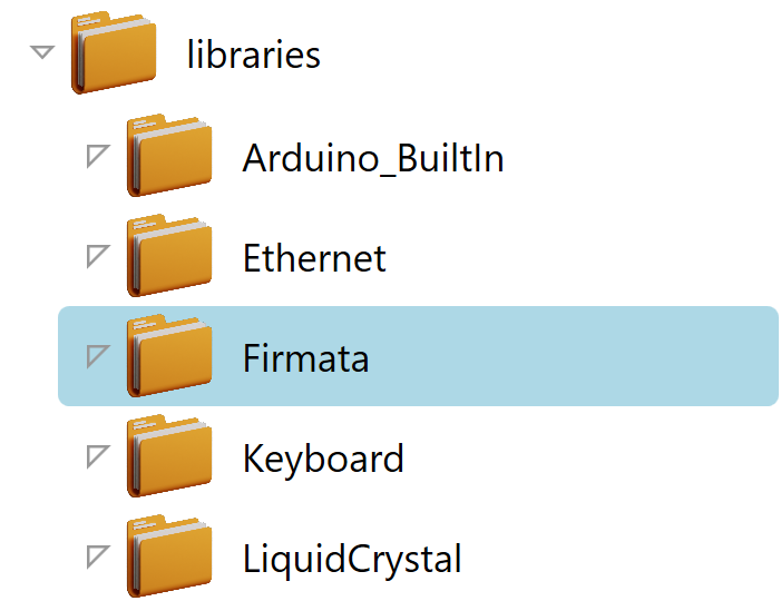
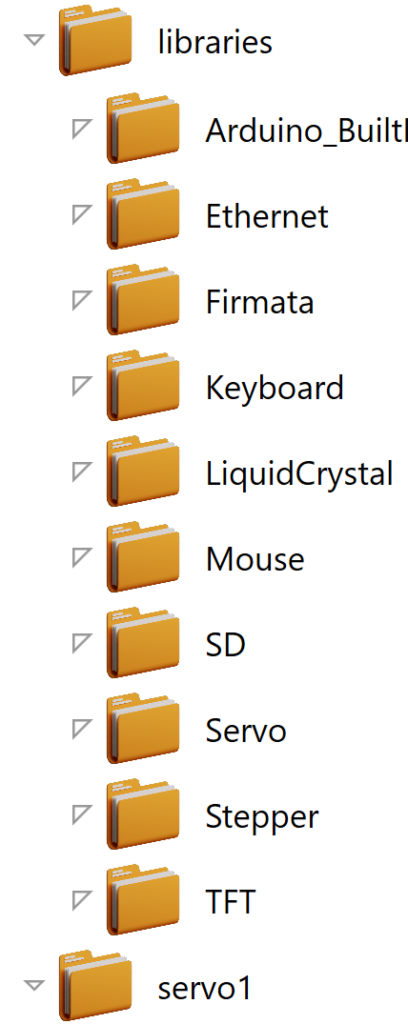
Here is a nice little treeview it needs commands and more but its a good start.
Quick Update
If we add this to the FolderModel we can then set which folder is active and affect it visually.
        private bool _isActive = false;
        public bool IsActive
        {
            get => _isActive;
            set
            {
                _isActive = value;
                OnPropertyChanged(nameof(IsActive));
            }
        }
To affect it visually we need to add this Style trigger to the XAML.
                    <Setter Property="IsExpanded" Value="{Binding IsExpanded, Mode=TwoWay}" />
                    <Style.Triggers>
                        <DataTrigger Binding="{Binding IsActive}" Value="True">
                            <Setter Property="Background" Value="LightBlue"/>
                        </DataTrigger>
                    </Style.Triggers>
Now we can do something like this.